Several weeks ago Edward Tufte released his new essay The Cognitive Style of PowerPoint. I received my copy in the mail the other day and spent 20 minutes reading his amusing, but sound, research. I get the feeling that he’ll largely be preaching to the converted with this effort since I know no designers—largely Tufte’s audience—that give presentations using PowerPoint. Mainly, it will fuel the fire of disgruntlement to those audiences imprisoned by PowerPoint’s style.
Before reading, I was curious to know how Tufte would attack PowerPoint for 24 pages—I’ve never known him to show such hostility towards an individual product. But he does an excellent job illustrating the enormous problems with PowerPoint culture—how PP slideshows are for the presenter—a good speaker doesn’t need to read from public notecards. PP bullet lists are making us stupid by heavily dilluting intelligent thought. The resolution of information is lost in the abbreviated format the program forces upon us. “Many true statements are too long to fit on a PP slide.” He occassionally throws in over-the-top jabs comparing Powerpoint users with power-hungry dictators like Stalin and Ceaser, that only delight the anti-PowerPoint reader.
Tufte Versus Nielsen
Not coincidentally, everything Tufte writes about PowerPoint is counter to what Jakob Nielsen has been preaching to us about writing for the web:
Write for scanability. Don’t require users to read long continuous blocks of text; instead, use short paragraphs, subheadings, and bulleted lists.1
And:
[R]eading from computer screens is about 25 percent slower than reading from paper…as a result, people don’t want to read a lot of text from computer screens. Therefore, you should write 50 percent less text—not just 25 percent less—because it’s not only a matter of reading speed but feeling good.2
Sure, Tufte is talking about PowerPoint slides, Nielsen about web pages, but they are at opposite extremes cocerning similar media. When I go to the New York Times web site, I expect the information to be highly detailed and thorough, exactly as it appears in the printed paper. I expect CNN to use many bullet points and subheads because it’s headline news afterall. That, and they generally report the sensationalistic results, not the context in which news stories take place, but that’s a different issue. Each method fits their respective sites’ audience. Nielsen’s tactics are inappropriate because of the wide variety of roles web sites play to their disparate audiences.
User-centered design
Some web sites simply aren’t created for the common good if that notion implies that users be able to find a web page from a Google search and locate the answer to their question (out of context) in five seconds flat so they can leave the site forever. Who creates web sites with that intention? Tufte would also claim to be an advocate of the user (or live audience), and providing background and complete thoughts are often more important than scannability—not that the two are mutually exclusive in the first place—and the full meaning of information cannot be trimmed to a laundry list. Bullet points are good for listing items or displaying linear steps, but not for showing the complex relationship between the items. “The more intense the detail, the greater the clarity and understanding—because meaning and reasoning are contextual,” writes Tufte.
Nielsen shows the following promotional writing example as the “control condition” of a usability experiment:3Nebraska is filled with internationally recognized attractions that draw large crowds of people every year, without fail. In 1996, some of the most popular places were Fort Robinson State Park (355,000 visitors), Scotts Bluff National Monument (132,166), Arbor Lodge State Historical Park & Museum (100,000), Carhenge (86,598), Stuhr Museum of the Prarie Pioneer (60,002), and Buffalo Bill Ranch State Historical Park (28,446).The following excerpt was labeled 124% better than the control (with criteria the reader isn’t privy, one of countless examples of dubious methodology in the NN/g), using “all three improvements in writing sytle: concise text, scannable layout, and objective language”:3
In 1996, six of the most-visited places in Nebraska were:
- Fort Robinson State Park
- Scotts Bluff National Monument
- Arbor Lodge State Historical Park & Museum
- Carhenge
- Stuhr Museum of the Prarie Pioneer
- Buffalo Bill Ranch State Historical Park
While the second is undoubtedly more scannable, at what cost are we to dumb-down our data? The loss of data points, the loss of narrative and the loss of intelligence name just a few problems with the “improved” version.
While I’m on the subject, another characteristic of the Nielsen method is that his entire dogma is a reaction to sample audiences’ immediate desires rather than a proactive example of setting high standards. Let’s throw enough shit against the wall to see what sticks the best, tweak it, and throw some more. Imagine writing a song based on audience feedback. (It’s already been done, with results as you’d expect, see Act Two). Nielsen disregards the fact that web sites have their own standards to uphold. If the New York Times followed mass appeal, there would be no more stories of Rwandan elections or goings-on in other non-tourist destinations. Fifteen-thousand word articles about politics in academics would be replaced with short articles of quick facts.
Tufte & The Columbia Accident Investigation Board
This Tuesday’s report by the Columbia Accident Investigation Board has given Tufte’s PP criticism wider exposure—an analysis of a Boeing slide from The Cognitive Style of PowerPoint was excerpted on page 191 of the CAIB report (or page 15 of this PDF), faulting the Boeing presentation with an extremely deficient rate of information exchange. Tufte’s makes the point that had this information been delivered in technical report accompanying the verbal presentation, important data might not have been overlooked. But it was the PowerPoint format—and the ambiguities, fragmentation and noise forced in the inherent PP style—that attributed to engineers not articulating the details. “We need serious methods of communciation for serious problems.”
When a reader argues that it’s the individual PP user at fault for the deficiency, Tufte explains on his site that the product, not the user, is to blame:
Saying that it is a problem with the user rather than the tool blames the victims of PP (the audience, the content, and the user)…This evidence [from examining thousands of PP presentations] points to inherent defects, unless one advances the entertaining hypothesis that nearly all PP users are stupid and that nearly all users of other methods are not. PP’s inherent defects are a much more likely explanation. That explanation also has a direct practical prescription—abandon PP—rather than asking millions of PP users to learn tricks in a vain attempt to undo inherent problems in a slideware computer program.
As for Apple’s Keynote presentation software, he makes no mention of it in his essay, but does say this on his site:
Alas the Keynote examples are as data-thin as PowerPoint. Only a few data points, no multivariate examples. Both Keynote and PP are tinker toyish.
An (ironically) abbreviated version of The Cognitive Style of PowerPoint appears in the September issue of Wired magazine as PowerPoint is Evil, juxtaposed to David Byrne’s essay Learning to Love PowerPoint that promotes Byrne’s new PowerPoint art DVD. But to get Tufte’s full essay, I recommend sending $7 to Graphic Press.
- 1Jakob Nielsen, Designing Web Usability (New Riders, 2000), 101.
- 2pp. 101-102.
- 3p. 105.
Other articles on Tufte and Powerpoint:

I’ve been really busy lately, which is the reason for my lackadaisical posting habits. Today, for example, is my first wedding anniversary, and since wife and I eloped one year ago today, we celebrated with a few friends & family last weekend, much too late for anyone to object to our nuptials (a method I recommend to all young lovers: get the frightening I do’s out of the way early, and enjoy the reception later without any nervous public speaking parts).
Soon we will go to Portugal, my wife’s home, and have another celebration with friends and family on the east side of the Atlantic.
Careful readers will note that we got married on a Tuesday. Tuesday night was when everyone was free. Witnesses Mike & Christene, Reverend John and fiancée Susana and I met at the Sunset Tavern at 6PM to discuss the evening’s plan over a pitcher of beer, reconvened later at the sandy bluff in Discovery Park, nice words were spoken from John, sim from Susana, I do from me, Champagne cork pop, glugglugglug, clickclick, gobbled cake with Right On! embroidered in red sugary dollops, drive to dinner, fancy tropical drink toasts, postcards sent, and it’s one year later, already.
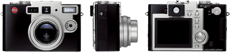
My new camera arrived in the mail early this week. It’s only a few days old and by far the best of the three digital cameras I’ve owned, and in my opinion, the best of any camera in its class. However, I already know that as soon as there’s a substantially better one, preferably one made by Leica, the Digilux 1 will be pushed to the backburner.
First, the good points
- It’s amazingly fast. With manual focus, it takes the picture when the shutter release is pushed. This is unheard of in digital cameras in this price range making it a true “reportage” camera.
- Best automatic exposure of any sub-$1000 digital camera.
- Best color of any sub-$1000 digital camera.
- Manual focus with an actual focus ring.
- Placement of controls and UI make sense and was designed more like a traditional camera.
- Standard flash hot-shoe.
- It’s a beautiful-looking camera. And it’s a Leica.
- When everything’s set to auto, it just takes good pictures and is fast enough to capture the moment. When set to manual focus, manual shutter speed and manual aperture, the photographer has total control.
What I’d like to see in the Digilux 2
- A removable lense format to allow wide angle and telephoto fixed-length lenses.
- A focus ring with increments on the lense. Right now you can’t look at the focus ring and set it for 8 feet. You have to use the viewfinder or digital display to see when it’s in focus.
- F-stop metering on the lense. The aperture is a function of the lense, and that’s where the control belongs.
- Faster image writing. Even though it takes the picture instantaneously (at least with manual focus; a fraction of a second wait with auto-focus), the next shot is delayed for a few seonds while writing the image. Times vary depending on resolution and the size and quality of the card used.
- More pixels. Why not 10 megapixels like the new Leica DIGITAL-MODUL-R?
- Non-retractable lenses. Right now the camera takes a little more than a second to retract the lense when first switched on. Why not turn the camera on, remove the lense cap, and start shooting?
- Better audio reporting — preferably some kind of clicking mimicking an analog camera for when shutter is released, or for long exposures, when the shutter opens and closes. With volume control.
- Some people complain about the camera’s physical size, yet it’s smaller than a Pentax K-1000 with lense. I have no complaint here and have no reservations taking the camera with me everywhere I go.

I just received my Modern Dog playing cards (2nd edition) in today’s mail. Each card has a different Modern Dog poster from 1995-2001. The pair’s style has been influential for years, but they even have a sense of humor in their mail packaging, as seen above.
Reading articles like these always remind me of the Winer quote, “If you want to be in Google, you gotta be on the Web.”
Google is beginning to have a subtle, but noticeable effect on research. More and more scholarly publications are putting up their issues in PDF format, which Google indexes as though they were traditional Web pages. But almost no one is publishing entire books online in PDF form. So, when you’re doing research online, Google is implicitly pushing you toward information stored in articles and away from information stored in books. Assuming this practice continues, and assuming that Google continues to grow in influence, we may find ourselves in a world where, if you want to get an idea into circulation, you’re better off publishing a PDF file on the Web than landing a book deal.
Of course any researcher who employs Google as his main tool is not conducting serious research. For real research, a trip to a good library is still required. But the quote subtly suggests the distinction between merely getting an idea into circulation (via the web, without a large marketing budget) versus trying to keep your media or publishing company profitable. It’s hard to do both. Amazon is attempting a similar strategy by planning to make the full texts of books available to user searches, but limiting the amount of text accessible to the user.
Now take search topics where users who are feeling lucky on Google are directed to Contact Sheet, however irrelevant (in Kottke fashion):
#1 - contact sheet - even though I’ve never discussed the concept of contact sheets or talked about photography in length on these pages. Someday I will; Google seems to be pre-empting me.#1 - scott steffens - duh
#1 - ransom note
#1 - omaha sugar daddy
#1 - milton bradley simon shockwave
#1 - nyt news tracker
A selection of close seconds and other notables:
#2 - make friends
#2 - frank gehry talks about seattle
#3 - times iraq altered photograph
#3 - tour de france elevation map
#3 - rem koolhaas design process
#5 - how long does freshly squeezed orange juice last?
#7 - smut magazines
#7 - quit vegetarianism
#7 - creative direction vs. art direction
#17 - underlying issues of the control freak
#17 - sexy 50-year-old woman
#21 - etiquette wearing white shoes before memorial day
All the smuttiness that Google tracks and directs over here (there’s a lot more, from looking through the dregs of referral logs) makes me feel like a politician who’s been quoted grossly out of context.

Yesterday Dave Reidy of the Coudal Partners wrote:
With a new Woody Allen film on its way, thoughts turn to his signature typeface, and the fact that none of us know what the hell it is. We think it’s this one. If you know differently, let us know.
I’d guessed that it was this one instead, at least for some of his late 70’s/early 80’s films. But since I’m such a big fan of his movies, I decided to take a closer look. I took all ten of the Woody Allen DVDs that I own and captured the title screens. As often as I’ve watched them, I was surprised to learn that his signature Windsor wasn’t used until Annie Hall then abandoned for two films, and that no titles were used whatsoever in Manhattan — just scenes of New York over his magnificent opening monologue. Seeing the titles side by side shows the nuances of using different studios and designers throughout the years, even if the base font family remained unchanged for 20+ years. Take a look at Ten Woody Allen Title Screens
For years I’ve kept manilla folders full of examples of great web design on my desk. Anytime I see a site that illustrates a new way of designing something I might be working on I’ll print it out so I can easily refer to it and flip through the stack of pages. It’s so much easier than pulling up screenshots or organizing bookmarks. It’s like creating my own custom issue of Communication Arts.
To print these web pages in the most accurate manner, I usually take a screenshot of the site, import it into Photoshop, upsample to 300 dpi, reduce to 8”x10”, and print it on HP Everyday Photo Paper, Matte (around $.14 a sheet in 100 sheet packages). Flipping through this folder is the best way for me to quickly brainstorm about ideas, navigation, organization, etc. Sometimes I’ll stick post-it notes on the print-outs as a reminder of what struck me about a particular site.
Lately I’ve been printing out sites of large organizations that incorporate a top universal nav bar (bbc.com & microsoft sites) that let users quickly navigate to the main areas within a large organization but have restrained color and styling so the nav bar can be applied to any microsite within the organization. Currently, these examples can be found near the beginning of the manilla folder.
If I’m soley interested in the content of the page, I’ll usually skip the details above and send it to the laserjet printer by hitting Cntrl-P from the browser. Not infrequently I’m disappointed to see that some pertinent bit of the content ran off the right side of the page by inadequate printing capabilities of the browser. In 2003, ten years since the first browser was introduced, you’d think the major browsers would have the simple task of printing down pat, but unfortunately I have to resort to the above method when I want an exact representation of what’s on my screen.
A recent Boxes and Arrows article illuminates some shortcomings of Nielsen/Norman Group methodologies found in their report Usability Return on Investment. It’s about time someone shed a critical light on their activities. While they preach user-centeredness, they have a very NN/g-centered view of usability. Both principles in the firm, Jakob Nielsen and Donald Norman, excel in overstating the obvious, especially in book form where they have plenty of room to repeat their assertions until the reader is numbed into submission. I read Nielsen’s column with the same skepticism I apply to any other columnist—he’s far too opinionated and commanding to be taken too seriously. (I also noticed a wee shift in Nielsen’s once-scathing opinion of Flash after Macromedia paid him large sums of money for his consulting work, an embarassment for both parties, in my opinion). Beyond that, their methods for drawing broad conclusions are dubious and often lazy, as seen in this intelligent review.
We took the camera to the ocean yesterday. Here are some of our discoveries.

This is where they make all those trees that you see around the Northwest. These trees need to have their branches and leaves appended and they’ll soon be ready to plant.

Fisherman branding.

Chainsaw carving in Westport.

Oceanside grass.