Graphic designer Michael Bieruit was recently interviewed by Newsweek about the achievements of Obama’s design:
He’s the first candidate, actually, who’s had a coherent, top-to-bottom, 360-degree system at work. Whereas, I think it’s more more common for politicians to have a bumper-sticker symbol that they just stick on everything and hope that that will carry the day.The thing that sort of flabbergasts me as a professional graphic designer is that, somewhere along the way, they decided that all their graphics would basically be done in the same typeface, which is this typeface called Gotham. If you look at one of his rallies, every single non-handmade sign is in that font. Every single one of them. And they’re all perfectly spaced and perfectly arranged. Trust me. I’ve done graphics for events —and I know what it takes to have rally after rally without someone saying, “Oh, we ran out of signs, let’s do a batch in Arial.” It just doesn’t seem to happen. There’s an absolute level of control that I have trouble achieving with my corporate clients.
Then if you go to the Web site, it’s all reflected there too—all the same elements showing up in this clean, smooth, elegant way. It all ties together really, really beautifully as a system.

Writes New York Magazine:
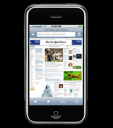
In press photos of the iPhone, the device displays a New York Times Web front page on its screen. And that page contains a tiny ad for Beautiful Evidence, one that ran on the Times site for exactly one Sunday. Tufte thinks the cameo was a lucky break. I have no doubt that it’s an anonymous Apple designer’s thank-you note.
The New York Times has a very cool interactive graph showing the words that were used in all of Bush’s State of the Union addresses. You can search for any word (“Iraq”, “Terror”, “Mass Destruction”) and see how its use has fared over the course of seven SOTU speeches.
Beyond that, it actually shows where in the course of the speech it was used (on a timeline) with a link to see the word used in context.
Very impressive.
I’ve returned from the HOW Design Conference that happened over the weekend in Chicago. It was a mediocre event, overall. The personal highlights were sessions with Stefan Sagmeister on his clever print production techniques and Brendan Dawes on his unusual computer interfaces (such as a snow globe with actual computer inputs). Disappointments were a typography session that was little more than an Extensis product pitch and Brian Collins of Olgivy’s Brand Integration Group giving a presentation that was identical to his talk from last year’s AIGA conference. (Hasn’t anything happened at Olgivy in the last year?)
One detail of last week’s Presidential debates that I nearly missed was the Democrat’s swag-bags they handed out to journalists before the event. Included in each of the bags was a pair of “W’s Amazing Rose-Colored Glasses”, which would enable the wearer to:
“See progress being made everyday!”
“Watch as outsourced American jobs turn into profits for your big donors!”
“Block out those pesky 45 million Americans without health care!”
The kicker: “Why bother changing your policies when you can just change your outlook.”
Many designers are talking about design in politics lately, but without any specific applications beyond poster design. Producing kitchy artifacts seems like a good way to apply design creativity to the campaign of your choice. Other ideas that come immediately to mind:
- Halliburton no-bid contracts a la Monopoly
- Maps of all the 60-odd countries aiding Al Queda in the 9/11 attacks, or countries possessing WMDs (with Iraq noticably absent from each)
- An image-rich booklet showing graphs of American troops in Iraq vs. the rest of the Coalition of the willing, who received the bulk of the tax cuts, workforce trends, and the reversal of the 5.6 trillion surplus in 2000 to current 5.2 trillion deficit, etc.
- and [cringing at the idea] Kerry-customized flip-flops
Time to get started, we only have 21 days until the election.
Last week I attended an AIGA lecture given by Clement Mok, president of AIGA. For those who don’t know, he’s the rebel-rouser behind a movement in the design industry to garner more respect for the role of design and to take the focus off designers and onto designing. Communication Arts also ran a copy of Mok’s article this summer to maximize exposure of his message throughout the community.
He’s been giving this lecture for a year and a half and, frankly, he seemed unfocused and tired of the material. From the perspective of this audience member, it was far too abstract to do anything with. Then again, my attention span has been a bit edgy after watching a 4-hour play (Homebody/Kabul) and a 4-hour movie (Lawrence of Arabia) within a few days’ time, but I digress. The lecture’s take-away was a 12-step guide aimed to unify the collective process of design and demand respect from our colleagues in other professions. The goal is achieved, as Mok explained, when a potential product needs created and they invite a financial guy, an engineer, a manufacturing specialist, and a designer to the table. Respect of design means that designers need to get involved from the beginning. But this riling up is reduced to a 12-step guide?
I believe most of what Mr. Mok said is true, that design is often reduced to something the black turtlenecks do to a product at the end. But if this is meant to rouse the troops, I think we need a more exciting message—a lot more jumping around and less placating lectures. If the shit’s hitting the fan, why the calm repose?
One problem, it seems, is that there is no easy way to evaluate a designer’s abilities, and the way we interface with clients is inconsistent and often hypocritcal from designer to designer and from firm to firm. Even when a new designer joins the team, there’s often a sense of threat if they have too big a role and too little qualifications — since these qualifications are currently left to subjectivity in the design field.
Doctors can’t perform certain procedues unless they have the education and experience. Even mountaineers have a strict code to show one’s abilities. You quickly know where a climber stands if they can lead on a 5.9 rock route, and can quickly evaluate if they’re qualified for a particular outing. In design, you can ask a candidate to whip out their portfolio, but what was their involvement in a particular piece? What experience, in thinking, in research, in getting things done, do they have beyond the finished portfolio pieces?
We can find benchmarks in our field—if we can’t evaluate ourselves on specific criteria, how can our clients? I don’t believe our portfolios should be a our only criterion in which we’re judged. As the dot-com bubble proved, I think we need some further level of status to separate those designers who are committed to the profession, and those that have abruptly switched gears, ripped-off another’s style and thrown together a pretty portfolio to become the Art Director of a new start-up. This happened in huge numbers in Seattle in the late 1990’s.
But Clement spoke against all of this, if only briefly. Instead, he said that we need more people designing to expose the value of what we do to as many as possible. I don’t disagree with this notion, but I stand firm that the problem lies not only with how we talk about design but also about how we talk about ourselves.
But I haven’t really addressed the heart of what he said—most of his talk is in the articles, which you can read for yourself by following the links above. You can get a more interactive version of the 12-step designing process with examples at designing.aiga.org/.
Oh, and I’ve returned from Portugal.
Several weeks ago Edward Tufte released his new essay The Cognitive Style of PowerPoint. I received my copy in the mail the other day and spent 20 minutes reading his amusing, but sound, research. I get the feeling that he’ll largely be preaching to the converted with this effort since I know no designers—largely Tufte’s audience—that give presentations using PowerPoint. Mainly, it will fuel the fire of disgruntlement to those audiences imprisoned by PowerPoint’s style.
Before reading, I was curious to know how Tufte would attack PowerPoint for 24 pages—I’ve never known him to show such hostility towards an individual product. But he does an excellent job illustrating the enormous problems with PowerPoint culture—how PP slideshows are for the presenter—a good speaker doesn’t need to read from public notecards. PP bullet lists are making us stupid by heavily dilluting intelligent thought. The resolution of information is lost in the abbreviated format the program forces upon us. “Many true statements are too long to fit on a PP slide.” He occassionally throws in over-the-top jabs comparing Powerpoint users with power-hungry dictators like Stalin and Ceaser, that only delight the anti-PowerPoint reader.
Tufte Versus Nielsen
Not coincidentally, everything Tufte writes about PowerPoint is counter to what Jakob Nielsen has been preaching to us about writing for the web:
Write for scanability. Don’t require users to read long continuous blocks of text; instead, use short paragraphs, subheadings, and bulleted lists.1
And:
[R]eading from computer screens is about 25 percent slower than reading from paper…as a result, people don’t want to read a lot of text from computer screens. Therefore, you should write 50 percent less text—not just 25 percent less—because it’s not only a matter of reading speed but feeling good.2
Sure, Tufte is talking about PowerPoint slides, Nielsen about web pages, but they are at opposite extremes cocerning similar media. When I go to the New York Times web site, I expect the information to be highly detailed and thorough, exactly as it appears in the printed paper. I expect CNN to use many bullet points and subheads because it’s headline news afterall. That, and they generally report the sensationalistic results, not the context in which news stories take place, but that’s a different issue. Each method fits their respective sites’ audience. Nielsen’s tactics are inappropriate because of the wide variety of roles web sites play to their disparate audiences.
User-centered design
Some web sites simply aren’t created for the common good if that notion implies that users be able to find a web page from a Google search and locate the answer to their question (out of context) in five seconds flat so they can leave the site forever. Who creates web sites with that intention? Tufte would also claim to be an advocate of the user (or live audience), and providing background and complete thoughts are often more important than scannability—not that the two are mutually exclusive in the first place—and the full meaning of information cannot be trimmed to a laundry list. Bullet points are good for listing items or displaying linear steps, but not for showing the complex relationship between the items. “The more intense the detail, the greater the clarity and understanding—because meaning and reasoning are contextual,” writes Tufte.
Nielsen shows the following promotional writing example as the “control condition” of a usability experiment:3Nebraska is filled with internationally recognized attractions that draw large crowds of people every year, without fail. In 1996, some of the most popular places were Fort Robinson State Park (355,000 visitors), Scotts Bluff National Monument (132,166), Arbor Lodge State Historical Park & Museum (100,000), Carhenge (86,598), Stuhr Museum of the Prarie Pioneer (60,002), and Buffalo Bill Ranch State Historical Park (28,446).The following excerpt was labeled 124% better than the control (with criteria the reader isn’t privy, one of countless examples of dubious methodology in the NN/g), using “all three improvements in writing sytle: concise text, scannable layout, and objective language”:3
In 1996, six of the most-visited places in Nebraska were:
- Fort Robinson State Park
- Scotts Bluff National Monument
- Arbor Lodge State Historical Park & Museum
- Carhenge
- Stuhr Museum of the Prarie Pioneer
- Buffalo Bill Ranch State Historical Park
While the second is undoubtedly more scannable, at what cost are we to dumb-down our data? The loss of data points, the loss of narrative and the loss of intelligence name just a few problems with the “improved” version.
While I’m on the subject, another characteristic of the Nielsen method is that his entire dogma is a reaction to sample audiences’ immediate desires rather than a proactive example of setting high standards. Let’s throw enough shit against the wall to see what sticks the best, tweak it, and throw some more. Imagine writing a song based on audience feedback. (It’s already been done, with results as you’d expect, see Act Two). Nielsen disregards the fact that web sites have their own standards to uphold. If the New York Times followed mass appeal, there would be no more stories of Rwandan elections or goings-on in other non-tourist destinations. Fifteen-thousand word articles about politics in academics would be replaced with short articles of quick facts.
Tufte & The Columbia Accident Investigation Board
This Tuesday’s report by the Columbia Accident Investigation Board has given Tufte’s PP criticism wider exposure—an analysis of a Boeing slide from The Cognitive Style of PowerPoint was excerpted on page 191 of the CAIB report (or page 15 of this PDF), faulting the Boeing presentation with an extremely deficient rate of information exchange. Tufte’s makes the point that had this information been delivered in technical report accompanying the verbal presentation, important data might not have been overlooked. But it was the PowerPoint format—and the ambiguities, fragmentation and noise forced in the inherent PP style—that attributed to engineers not articulating the details. “We need serious methods of communciation for serious problems.”
When a reader argues that it’s the individual PP user at fault for the deficiency, Tufte explains on his site that the product, not the user, is to blame:
Saying that it is a problem with the user rather than the tool blames the victims of PP (the audience, the content, and the user)…This evidence [from examining thousands of PP presentations] points to inherent defects, unless one advances the entertaining hypothesis that nearly all PP users are stupid and that nearly all users of other methods are not. PP’s inherent defects are a much more likely explanation. That explanation also has a direct practical prescription—abandon PP—rather than asking millions of PP users to learn tricks in a vain attempt to undo inherent problems in a slideware computer program.
As for Apple’s Keynote presentation software, he makes no mention of it in his essay, but does say this on his site:
Alas the Keynote examples are as data-thin as PowerPoint. Only a few data points, no multivariate examples. Both Keynote and PP are tinker toyish.
An (ironically) abbreviated version of The Cognitive Style of PowerPoint appears in the September issue of Wired magazine as PowerPoint is Evil, juxtaposed to David Byrne’s essay Learning to Love PowerPoint that promotes Byrne’s new PowerPoint art DVD. But to get Tufte’s full essay, I recommend sending $7 to Graphic Press.
- 1Jakob Nielsen, Designing Web Usability (New Riders, 2000), 101.
- 2pp. 101-102.
- 3p. 105.
Other articles on Tufte and Powerpoint:

I just received my Modern Dog playing cards (2nd edition) in today’s mail. Each card has a different Modern Dog poster from 1995-2001. The pair’s style has been influential for years, but they even have a sense of humor in their mail packaging, as seen above.
Looking at graduate design school programs, I’ve been surprised by all of the nasty web sites. In the bigger liberal arts schools, it’s hard enough just to find the design program. Is it within the Art department? Is it a separate college? Should I take this graduate programs link?
I’m particularly surprised with the major schools with long histories that specialize in design showing such a bad face online. In no particular order, here are some of my experiences, with RISD coming out well ahead of the pack.
University of Washington — There is a small amount of information on each of many separate pages. If you want to print the cirriculum, for example, you end up printing 25 pages that are 1/5 filled.
Yale — nearly impossible to find the design program either by navigation or search. The scant material that is available online is optimized for neither on screen nor printed viewing.
Cranbrook — this thing is a train wreck and an embarassment to the school. A progression of pop-ups give you no sense of place. After ten minutes of frustration I couldn’t find out if they even have a graduate program. Impossible to navigate; an utter failure in design.
University of Cincinnati — for a large liberal arts school, this design program was the easiest to find within the school’s bigger web site. When you dig deep enough, you get on-screen PDFs. Great for printing, but there should be another layer optimized for the web. Also, the School of Design microsite doesn’t give you the sense that this has been substantial player in the history of American graphic design, which is has.
RISD — the best web experience of any I tried — from the beginning the visitor gets the sense that this is a serious design institution. I have a few nits about the resized pop-up window (why can’t they design a site that doesn’t take over my browser?). All information I needed was well-optimized for web and print reading.
CalArts — An attractive, straightforward design that is made for the web. Easy to navigate and it does a good job of showcasing the school’s strengths. That is, until you get to the Design School microsite which is a dizzying Flash tornado that tells you nothing. The Cirriculum link doesn’t even work.
 I love the preliminary research before a project begins. So I picked up The Education of a Graphic Designer to start a personal investigation while I consider a master’s degree. It’s turned out to be the perfect book to help organize thoughts around graduate design school — what should be valued in design education, which trickles down to reasons for enrolling and what to expect from a good institution.
What follows are some rough notes from the first essay, Education in an Adolescent Profession, by Katherine McCoy.
In short, design education is heavily dilluted because:- There are no universally recognized guidelines of what qualifies one as a professional graphic designer
- The focus is too often on applied design where students learn how to respond to common design problems (akin to flipping through CA) instead of the underlying design fundamentals at play
- Few colleges understand that design is not simiply the commercialization of fine art
Bauhaus Design Fundamentals: Correct
Architecture was the earliest design field and the only one to exist 100 years ago. The Bauhaus were the first to lay ground rules, showing the need for a set of design fundamentals before addressing the pragmatic design need:
The Bauhaus Basic Course was the first in design education to declare that basic design principles underlie all design disciplines, that primary design education should begin with abstract problems to introduce these universal elements before students proceed to tackle programmatic design problems applied to specific scales, needs and media. This emphasis on abstraction and experimentation, and the rejection of accepted traditional formulas, represented a radical new attitude in education.
The Bauhaus method of design principles were slow to make their way to US schools and went through Switzerland before being adopted by major studios in the 1960’s and eventually taking root in Yale and other premier schools.
Based on objectivity and rationalism, this [Swiss] educational system produced a codified method that was easy to communicate to students, giving them a foundation for a visual design process and composition that went far beyond the superficial emulation of their heros.
But even today, the Bauhaus style of abstract experimentation is usually limited to introductory design survey courses, after which students are forced into a specialization where the simulation of real-world design ensues.
Master/Apprentice: Incorrect
Many schools emulate the master-apprentice model. The apprentice initially takes on the mechanics of the master’s work, taking on more and more craft as his skill progresses. Although more vocational than academic, this educational style maps more easily to the job market from the start, and is the driving force behind this method — to boost graduate employment rates. The main problem is that it’s not based on any kind of design standards, but the personal style of the master.
This lack of formalized method has been almost universal in our art schools and university art departments until recently. The typical approach has placed a premium on creativity, a flash of intuition, the Big Idea, and educators have encouraged this, through exposure to “samples and examples”… Graphic design magazines and competition annuals have been most students’ only resource. Emulating the work of renowned designers could be seen as a weak continuation of the master/apprentice system without the benefit of personal contact between student and master.A nugget relevant to my personal quest:
Graduate study should never imitate professional practice; rather, it should challenge students to look deeply into the discipline and into themselves to connect design to its culture, its history, its users, its society, and its technologyAnd some comments on what lies at the intersection of design and other disciplines that surfaced during a conversation I had with Dave Shea:
But we hear a continuing debate as to whether this profession should lean toward art or toward science. The most recent influences add a third contender to the art/science debate. Literary and critical theorists see design as a language to be read—that graphic design might be considered a form of visual literature.
Although all three orientations are preoccupied with communication and meaning, each stresses a different component of the sender-transmitter-receiver communication model. Design as art is concerned with personal content and expression; design as science is concerned with systematic presentation of objective information; and design as language is concerned with the audience’s reading or interpretation of text and content … Certainly, graphic design will be the richer for the exploration of all three directions.
More to follow.
Highlighting the intersection of design and rock ‘n roll, the Experience Music Project is running an exhibition entitled Paper Scissors ROCK: 25 Years of Northwest Punk Poster Design running through September 7th.
The idea of rock posters in a nice new museum seems a little out of context (come to think of it, the idea of a museum dedicated to rock’n’roll seems hopelessly restrained), but I’m still glad it’s happening. This review sums it up:
The problem with an exhibition of rock posters is that postering is messy, and exhibitions tend to be neat. This, in critical parlance, is a frame problem, and EMP has been saddled—and in turn, has saddled a few exhibitions—with a frame that is too bland, that tends to turn the chaotic, emotional experience of music into something neatly patted into a manageable shape.
In related news, the Stranger’s Poster of the Week has been added to the links page.
Jeffrey Zeldman talked about art direction vs. design last week, and mentioned something that’s been on my mind for a long time. I’ll quote him at length:
Many design curricula encourage their students to develop a unique visual vocabulary (a style) that can be grafted onto any real-world project, regardless of its audience or message. Most superstars of print or web design have followed that advice. Their work is about their sensibility, not about the product or service. It communicates, at most, that the product or service is cool or edgy.
Design no longer serves the product; the product serves the design. The product is merely a vehicle allowing the designer to express his vision. Thus design becomes a commodified version of fine art (and practically the only version of fine art that pays).
Zeldman lays out an accurate analysis of the current state of web design — look at the web design award winners — the sites are usually highly attractive, stylized, unusable sites, where the potential empowerment of the target audience is usurped as a monument to the designer.
Why, then, is successful art direction hard to find on web sites while stylized self-indulgence appears everywhere?
Obviously, the web as a medium must be utilitarian — you can’t turn the physical pages with your hands, so the UI must be omnipresent. Since standard HTML UI is considered ugly (and displayed differently by each OS and browser), or blue underlined links are inconvenient for a particular design (guilty as charged), the UI is invented uniquely by every web designer out there. And as with any physical product from toothbrushes to sneakers, the design is stylized, ideally, but not commonly, as a continuation of the brand.
The UI makes up most of the visual information that a visitor sees. That’s why web designer is commonplace while web art director is not. Magazine sites can’t fill their index pages with cover images (i.e., traditional art direction) because if people can’t immediately find the table of contents on the web, they’ll go somewhere else. So the role of art direction on the web becomes subordinate — the art direction is in the subsidiary editorial artwork — there are no full spreads.
Even sites that display some degree of art direction in their content (like Salon, Slate and Jugglezine), the UI design still visually defines the site, however subtle or overpowering it may be.
But this is getting beside the point. Because the medium doesn’t allow obvious opportunities for art direction doesn’t mean web sites must be exploited agents for the designers’ commodified fine art. Art direction on the web is about matching appropriate UI style with the brand, setting tone and enforcing consistency across microsites and ad hoc digital media, working with the designer to balance usable functionality and accessibility of content for the end user (no extra plug-ins necessary).
And as with any product from toothbrushes to sneakers, everyone involved must observe the target audience using the site and make changes accordingly. If sites achieve these goals and are still nice to look at, the web will have come a long way.
The Art of Explanation from Poynter Online is a collection of published news illustrations and notes of the newsroom conversations that took place during the creation of war-related graphics. The visual journalists detail the strategy and process behind their illustrations—an interesting look into the thought processes behind this visual side of the news.
A German illustrator who submitted his graphic How Much US Weapons Cost is forward about his feelings for the Iraq war and talks about some graphics, such as Saddam’s bunker, which are purely speculative.
A Spanish graphic artist for El Correo describes his team’s illustration of combat over a bridge in Iraq:
We’re trying to avoid the “Map and arrows and flying around planes” formula and trying to create graphics that tell stories to our readers.

Be sure it’s clear to the person to whom you are talking that the conversation is finished. Then replace the receiver gently. A receiver banged down may seem like slamming the door in someone’s face.
When my grandparents did some housecleaning a few years ago, they offered me this instructional booklet entitled How to make friends by Telephone and asked if I’d be interested in it. I estimate it to be from the 1940’s — it’s from an era when it was still proper to capitalize Telephone, much like the capitalization of Internet today, which will cease when it’s finally seen as a common utility (there’s already a crusade underway).
It has scribbles on some of the pages, probably from a relative of mine, maybe my mother when she was learning the etiquette of proper phone usage.
Click on the image to advance through the pages.
And remember: speak to the person at the other end of the line — not to the telephone — then you’re more apt to be pleasant and understanding.
Here’s an amusing version of the Quark 6 press release translated for longtime Xpress users.
UPDATED
If you’re not familiar with design software tools (and even if you are), here’s a brief history and commentary of Quark, Pagemaker and other design programs throughout the years.
And more on the innovation and stagnation of Quark XPress and why InDesign hasn’t gained more marketshare.
From Decoding Visual Language in News Content
News delivery in this country is increasingly comprised of carefully crafted displays of visual information. As consumers of information, however, most of us have never been taught to critically read or decode images and other graphic displays of information in the same ways that we have been taught to analyze verbal communication. We are taught reading comprehension and writing skills throughout most of our educational experience, but not visual language comprehension. Yet, if we wish to remain critical viewers of the news media in the midst of this imagedriven, converging media landscape, we must develop equally sophisticated visual literacy skills.